Facebook Blueprint
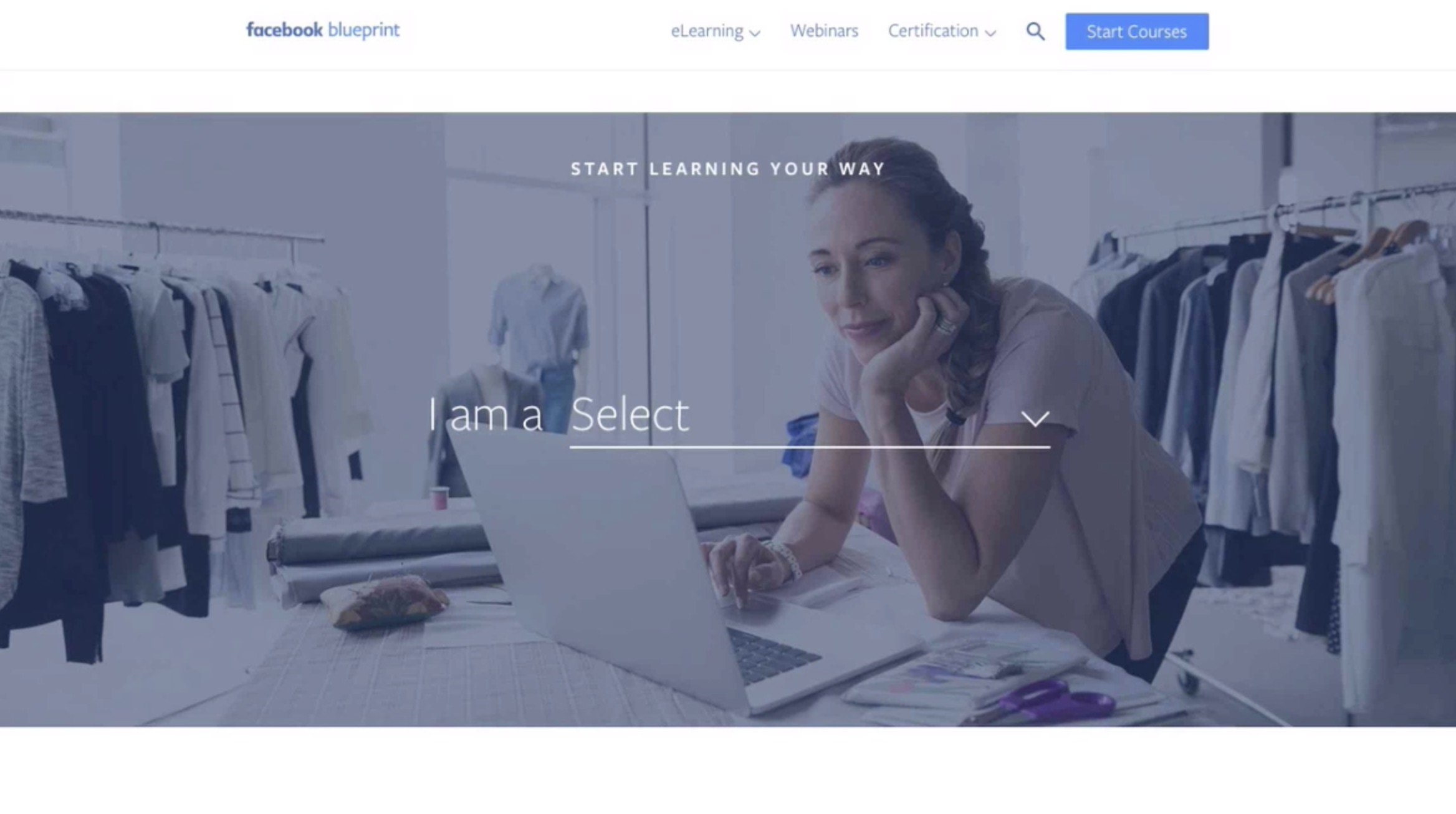
Facebook Blueprint is the educational arm of Facebook Business, a sort of sub-brand. This brand was created within the Facebook family but with a more education forward flow aimed at existing customers and users, versus a brand aimed at the general public. Working closely with the brand lead, I kicked off the project with a new web site, UX, color themes, and an illustration style derived from the larger Facebook style that focused more on using blue tones to really drive home the blueprint look and feel. I also recruited our agency partner HELLO design to help flesh out the remaining assets.
THE PROBLEM
This is a new avenue for Facebook focused on education.
THE BRIEF
Distill the complex social advertising and marketing world into a visual and tonal language that anyone can begin to understand.
INSIGHTS & LEARNINGS
Short and simple messaging really does win over a paragraph of information. Less visuals is better.
THE BRANDING
Simply, the logo and colors are derived from the parent brand Facebook (white spacing lines excluded, lol). As an educational section of the overarching brand, we developed a concept around building your business on the Facebook platforms. Quite literally leaning into what it takes to raise… well, a building.
We made our own display font based on blueprint sketches from architectural drawings. Created with both Mobile and Desktop weights, this font is used primarily as headlines on web pages, landing pages, event collateral, and advertising.
PHOTOGRAPHY
We use photos displaying genuine emotion and human interactions. Photos should look natural and candid, with plenty of natural light around the subjects. Hands-on is a recurring theme to show how people learn today. Whether in group settings collaborating or solo behind the desk or on their device.
PUTTING IT TOGETHER ON THE WEB
Facebook by itself is forever evolving and changing. When creating a new voice in the mix it’s always best to stick close to the parent and allow changes to flow into one another. Making something unique with small changes and additions that also allow things to shift without breaking.
My Role: Art Direction, Design, User Experience, Prototyping, Branding, Story
Hello Design: Design, Web, Typography, Branding
Leonardo De La Rocha: Creative Lead and Producer
Allie Townsend: Copywriter
Amy Brooks: Program Lead
Sonny Brabez: Engineering
Length of Project: 2 Years
Awards: Mobile Thumbstopper Award


