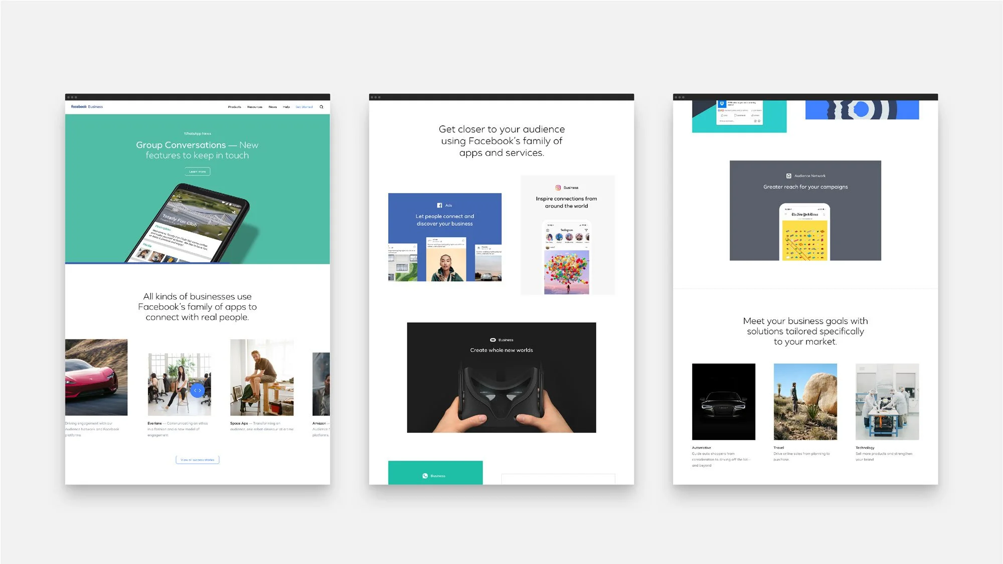
Facebook Branding & Web
This brand development involved weaving together all of the ever-growing brands under Facebook to create a single tapestry where they could all co-exist. I worked with marketing executives and creative leads to express our vision through homepage, and key product page designs along with the immediate examples of where our brand is most own-able. Such as, illustration, typography, color, and our news articles. At the beginning of this project we had 16M monthly visitors to the site, through iterations of the project between 2016 and 2019 we grew that number to over 30M.
THE PROBLEM
Facebook and its brands have a lot of information to bestow unto their users, and with a lot of brands comes a lot of initial disparity as well. We needed to first attain all information to then make difficult decisions through trial, and error, on the “what” part of the equation.
THE BRIEF
Bring together the Facebook family of apps and services into one unified online location that provides critical announcements, news, and helpful information to users.
INSIGHTS & LEARNINGS
Sharing is caring, and we’re all in this together. Information and data are your best friend when making a point. When in doubt, partner with engineering teams, or ask lots of questions. Always think “mobile first.”
COLOR
Each of our platforms has a lot invested in their unique identities. We primarily use their existing brand colors when designing their pages, to let them stand apart from each other.
PHOTOGRAPHY
We shoot photography with a documentary approach to tell real stories about real people. With the idea that there’s always more than one way to photograph a story but used effectively, it’s a powerful tool to convey human impact, establish empathy with viewers and make our content more relatable.
HUMAN
Businesses need people to build their communities and grow. And no one knows people like Facebook. Simply put, we’re here to help companies get closer to their customers.
MESSAGING and TONE
EMPATHETIC
We understand businesses because we are one. Millions of companies of all shapes and sizes come to Facebook to succeed. We care about who they are, why they’re here and how we can help.
CONFIDENT
Businesses look to us because we have some of the most powerful tools and insights available online. We inspire confidence by knowing our offering, and conveying its value to those who could benefit.
CLEAR
Our audience is busy, and they need our help to get things done. We respect their time and attention when we communicate with them in the simplest terms, avoiding jargon, and getting straight to the point.
TYPOGRAPHY
Our typography for marketing was previously built around Freight Sans. Now, we’re making the transition to Facebook Sans, a proprietary geometric sans serif family with the tone, technical details and language support needed to modernize our typographic voice.
MOTION
Time is our most valuable asset so using a limited set of easing curves to control all animations results in a branded motion signature. Our motion is smooth but snappy, making interactions feel more human without wasting any of our users’ time.
APPROACH and PUTTING IT TOGETHER
So many pieces create a holistic brand experience. From buttons derived from the shape of logos to cinema experiences shown on a persons mobile device. It all plays a vital role in how a brand is perceived and how that brand tells its story. At Facebook we chose to make it the most intuitive, simple, and beautiful.
My Role: Art Direction, Design, Illustration, User Experience, Prototyping, Story, Data Collection
Instrument: Design, Branding, Motion
Sonny Brabez: Engineering, CMS Development
Allie Townsend: Copywriter, Content Strategy, Story, Site Map
Ilana Solomons: Copywriter, Content
Scott Larson: Executive Creative Director
Sang Han: Creative Lead and Producer
Leonardo De La Rocha: Creative Lead
JJ Gray: Creative Lead
Chean Wei Law: Creative Lead
Length of Project:
Ongoing, 4 years


