Facebook Visual Systems
One of the many pieces to a large brand is of course the approach to a simple visual language that represents complex ideas and guides through products, our illustrations. This seemingly small undertaking was certainly one of the largest tasks as it identified disparities across platforms and products, and opened up the road to a consistent visual system across the company. I hand-picked a small team for the initial illustration drafts, focusing on iconography to then build out a larger illustration voice. From those initial steps, the recruited creative lead led the charge with Buck as our illustrative agency.
THE PROBLEM
This was a self initiated endeavor after a conversation with product leads and newly developed brand teams. It consisted of a lot of internal brands and processes, and a lot of disparate visual languages.
THE BRIEF
Sync with internal brand teams and product teams to create one consistent visual language across all Facebook platforms.
INSIGHTS & LEARNINGS
Working together, towards one common goal will always be successful.
ILLUSTRATIONS EVERYWHERE
With so many teams working towards their goals, and so many teams joining existing teams around the company it gets difficult to take stock of which illustrations belong to which brand. We had quite a bit to start with.
REGROUPING
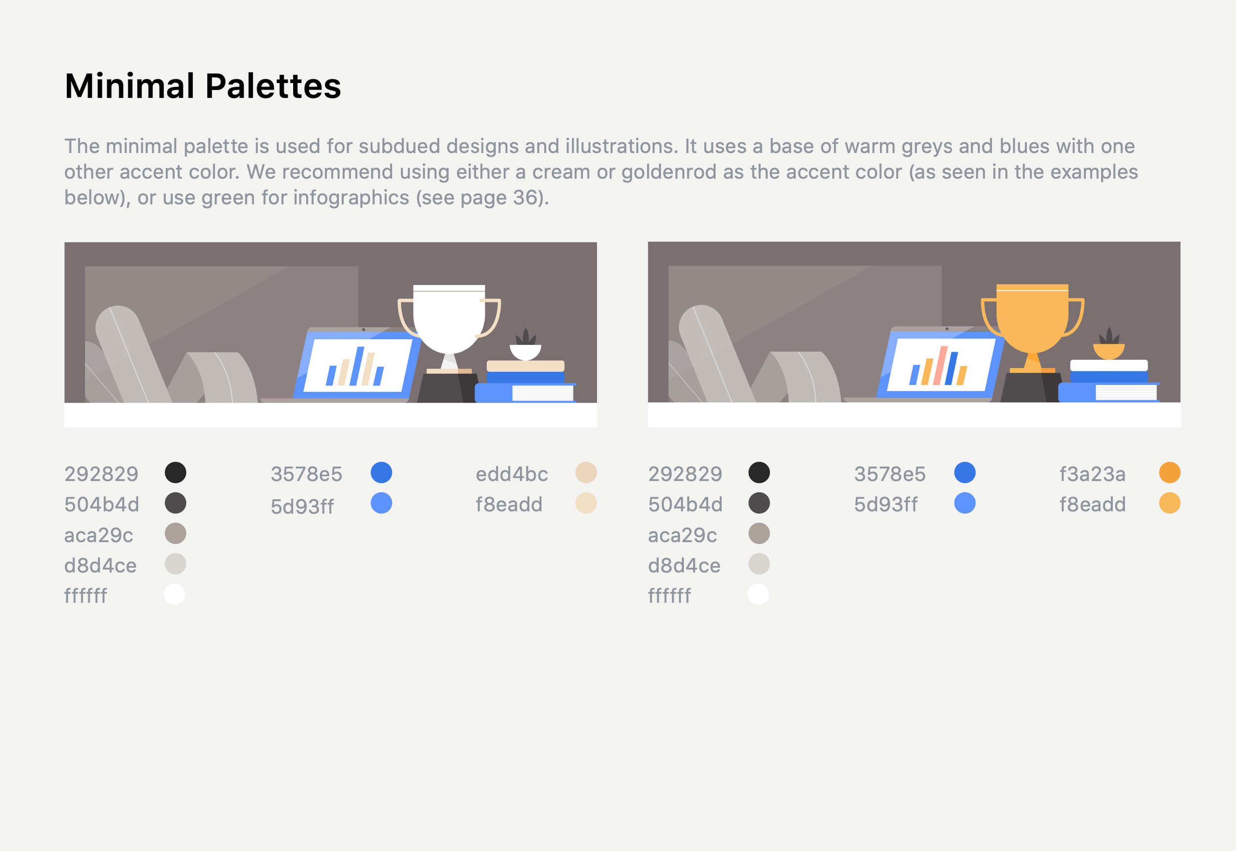
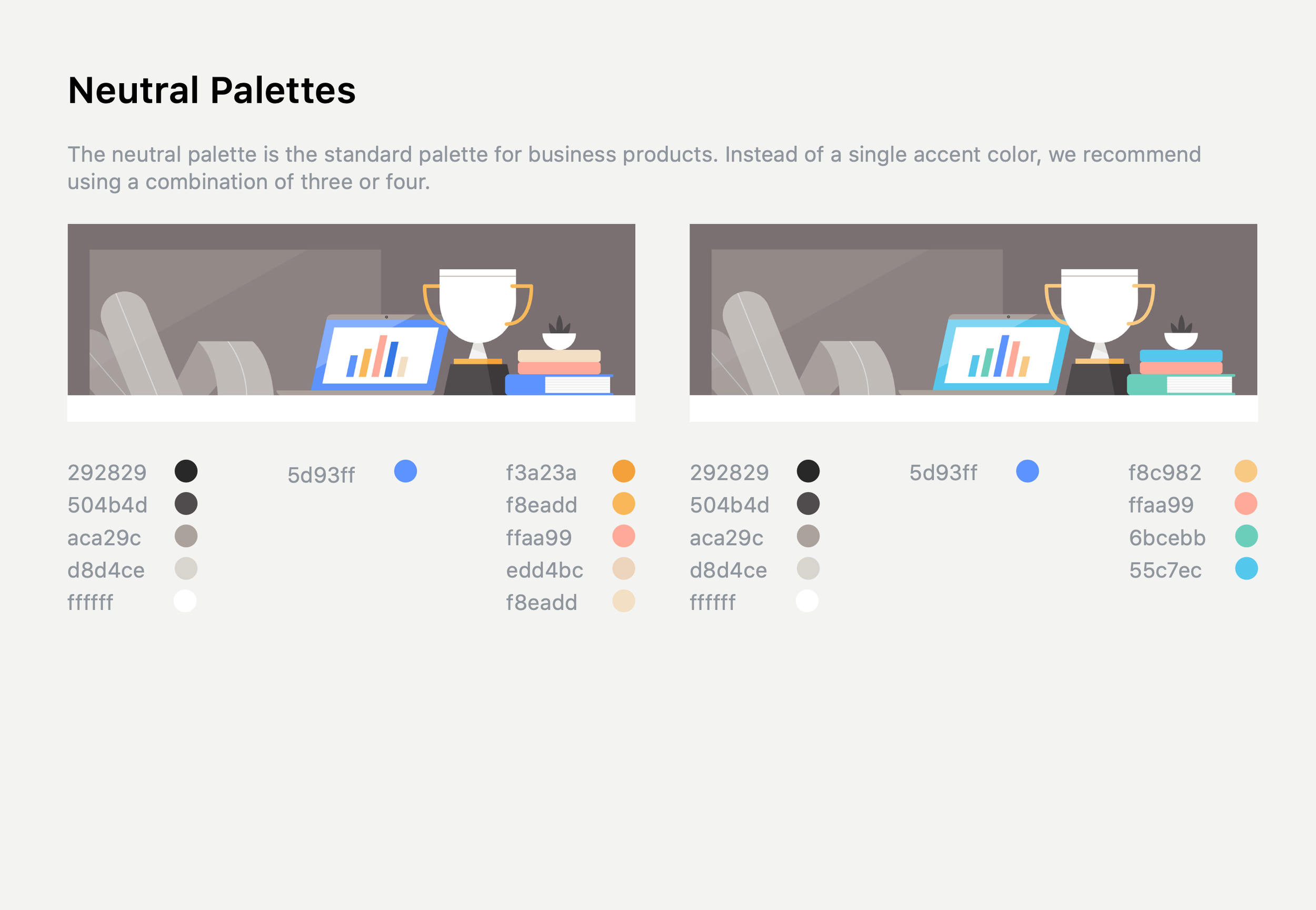
After taking inventory of all illustrations and icons throughout the company and its products we came together as one team from all teams and identified the most common and most important visual metaphors. From their we literally sketched out all of our takes and had creative leads make selects and define a style.
DEFINING STYLE
After we went through various exercises and approvals across all of the Facebook brands and product teams we now needed to define illustration standards, a request and creation system, and assets for design teams to pull from.
My Role: Art Direction, Project Management, Design, Illustration
John Barreto: Creative Lead, Illustration
Buck: Illustration
Length of Project:
6 Months


